A great logo had already been developed by my good friend Fred Swart. Notice the “iris” of the eye reflected in the icon. This logo served its purpose admirably for a number of years but by the time I was asked to work on it, it was felt that it needed a “friendlier” approach. From there then the rainbow colours and the use of lower-case letter work.
Awareness Campaign
"Eye, Love, Jozi" Campaign Icons
Campaign Flags
T-shirts
This awareness campaign was launched to help advertise the fact that theeyemakers are active in the local Johannesburg community. Screenings were set up at various local schools and eye-catching marketing material was developed to heighten visibility.
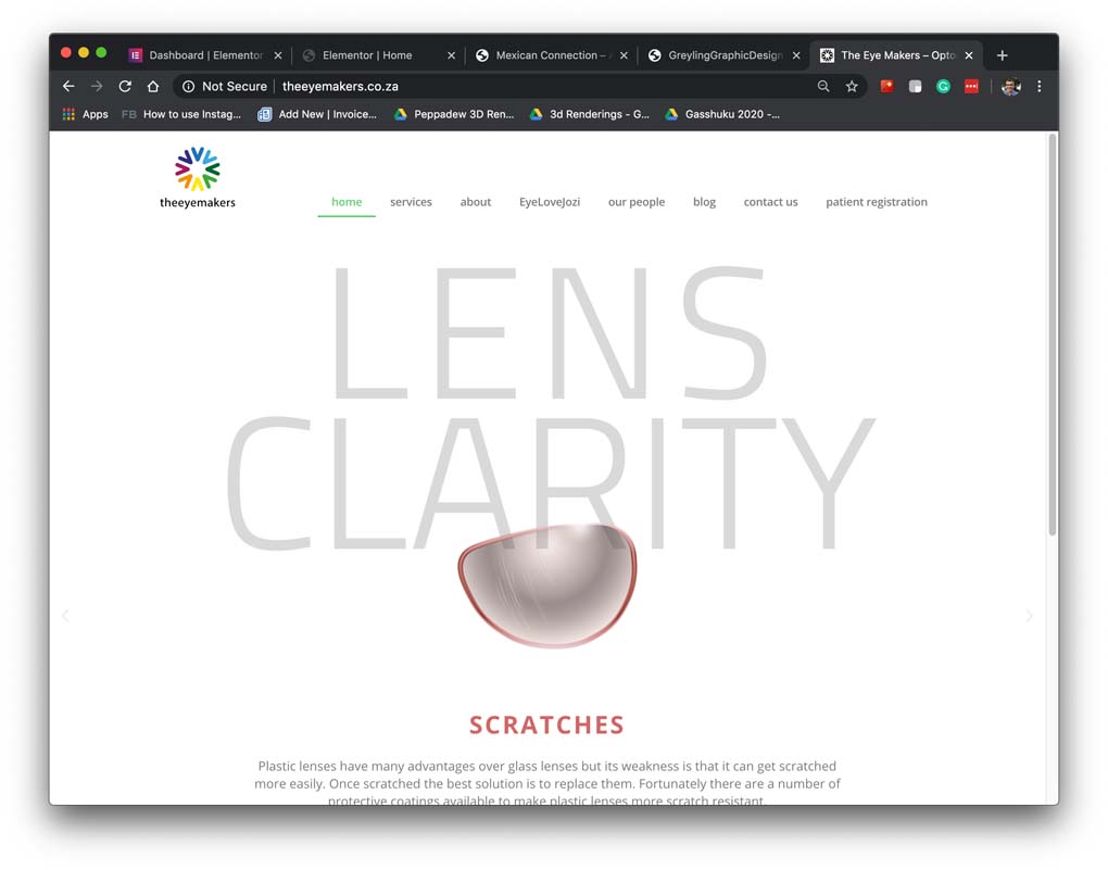
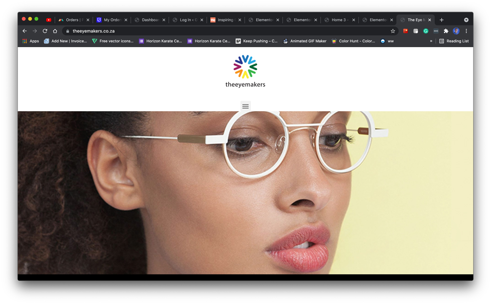
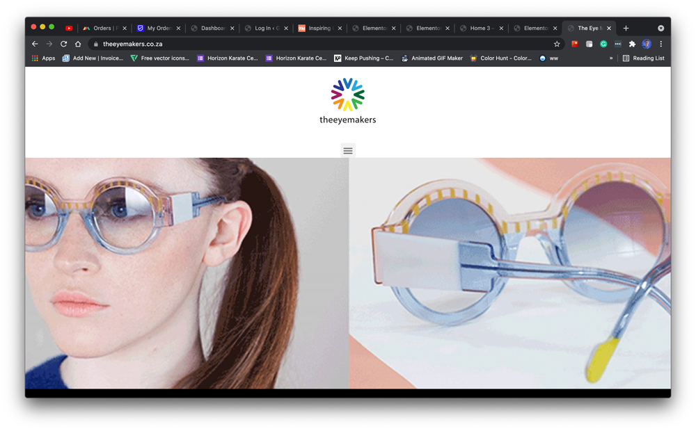
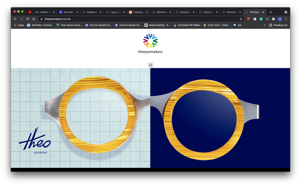
Website
The website is an ongoing project which keeps on changing with the ever-changing demands and tastes of theeyemakers customers. The latest addition is a catalogue that shows the most prominent brands of eyewear. Customers often prefer to shop in the comfort of their home and having a website that shows what brands are available goes a long way to help with the selection process.